

If you're running a SaaS company between $5M and $50M ARR, you probably already track monthly churn. The problem is that a single churn percentage hides every decision worth making - which cohorts are deteriorating, which acquisition channels produce customers who actually stay, and whether your NRR supports the runway you're modeling.
SaaS cohort analysis fixes that. It breaks your customer base into time-bounded groups and tracks what each group does month by month. Done right, it gives you three things: a clear picture of retention quality, a reliable revenue expansion signal, and a defensible CAC payback calculation.
This article gives you the structure to build all three - from raw data to board-ready interpretation.
What you'll learn
- The three cohort tables that give you a complete FP&A picture: retention, revenue expansion, and CAC payback
- How to read retention curves and act on what they show - not just report them
- The benchmark ranges for NRR and payback periods at your ARR stage
- Five mistakes that make cohort analysis useless, and the replacement moves for each
- A cohort analysis template outline you can build in a spreadsheet this week
What cohort analysis is (and what it actually tells you)
SaaS cohort analysis groups customers who started at the same time - usually the same calendar month - and tracks their behavior over subsequent periods. Each row in a cohort table is a cohort. Each column is a period since start (month 0, month 1, month 2...).
The output is not a single metric. It's a time-series picture of how each customer group adopts your product, generates revenue, and either stays or leaves.
Here's why this matters for FP&A specifically: a blended monthly churn rate of 4% tells you nothing about whether you have an onboarding problem, an ICP problem, or a pricing problem. Cohort analysis separates those failure modes because they produce different shapes.
The shape is the signal. A number without a shape is just a data point.
The three cohort tables your FP&A model actually needs
Most cohort analysis implementations stop at a retention heatmap and call it done. That's incomplete. A decision-grade cohort system requires three tables, each answering a different question.
Table 1: Customer retention - who stays?
This is the foundational view. Rows are monthly cohorts, columns are months since first payment, and each cell shows the percentage of that cohort still active.
Build it on first-payment cohorts for subscription SaaS. Signup cohorts add noise from trial behavior and delay the signal you actually care about - paying customer retention.
Minimum data required:
- Customer ID (stable, unique)
- First payment date (your cohort anchor)
- Status per month (active or not)
- Revenue per month (for the tables below)
A clean export from Stripe, Chargebee, or Paddle plus a pivot table in Google Sheets is enough to start. The goal is a table where two people asking the same question get the same number. That's the only definition of "done" that matters here.
Table 2: Revenue retention - do customers grow?
Logo retention tells you if customers stay. Revenue retention tells you if they're worth keeping.
Build a revenue-based cohort table using the same cohort definitions. For each cohort month, track the sum of MRR from those same customers over time. Divide by the starting MRR at month 0 to get cohort-level NRR.
Mini example:
The February cohort above is a problem. Even if it shows acceptable logo retention, its revenue is contracting. That means downgrades or discount roll-off are outpacing any expansion. You'd miss this entirely in a blended NRR figure.
Table 3: CAC payback - when do you get your money back?
This is where cohort analysis connects directly to runway, headcount, and capital allocation decisions.
The calculation:
- Assign CAC to each cohort month (blended: total sales and marketing spend / new customers acquired that month)
- Calculate the cohort's monthly gross profit (MRR x gross margin %)
- Sum gross profit cumulatively month by month
- Payback month = the first month cumulative gross profit exceeds cohort CAC
If cohort CAC is $120,000, payback lands in month 3. If payback is stretching beyond 18 months, the cohort is telling you the economics don't work at that spend level - before you've committed to the next hiring cycle.
How to read retention curves: the shape tells you what to fix
Once you've built your retention table, plot the curves. You'll see one of the shapes from the table above, or a combination.
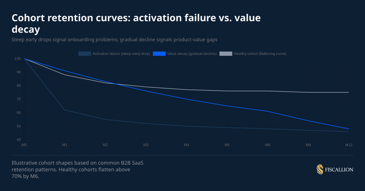
The chart above shows three distinct curves. The key diagnostic question is: where does the drop happen?
If the drop is in M0 to M2: Your onboarding is the problem. Customers signed up with a certain expectation and the product didn't deliver fast enough. Fixes live in implementation speed, feature discoverability, and how your sales team sets expectations.
If the drop is gradual across 6 to 12 months: The product delivers some value but not enough to make switching costs stick. This is a product-market fit problem at the customer segment level, not a usability issue. It often correlates with a specific ICP segment or acquisition channel.
If there's a cliff at M12: Annual renewals are failing. The cause is usually one of three things: price increases at renewal, procurement friction, or a change in the customer's business that made your product less relevant. Check whether the cliff correlates with a specific plan type or account size.
Here's an example: A company reporting 3.2% monthly blended churn had concluded they had a product-market fit problem. When we built the cohort decay curve, months 1–3 retention was actually strong at around 94%. The real problem was a cliff at month 6, which coincided exactly with the point where initial onboarding support ended and customers moved to self-serve. Customers who churned at month 6 had lower product adoption scores at month 3. The fix was extending structured onboarding for low-adoption customers through month 8 and adding a proactive check-in at month 5."
One practical rule from Fiscallion's FP&A work: if you can only slice your cohort table one way, slice by customer segment or plan type. A blended table is the worst-case scenario because it averages across segments that behave very differently, producing a retention number that represents no actual customer.
NRR benchmarks: what good looks like at your ARR stage
Your cohort-level NRR needs context to be actionable. Here are the benchmarks from 2025 B2B SaaS surveys covering 1,000+ private companies.
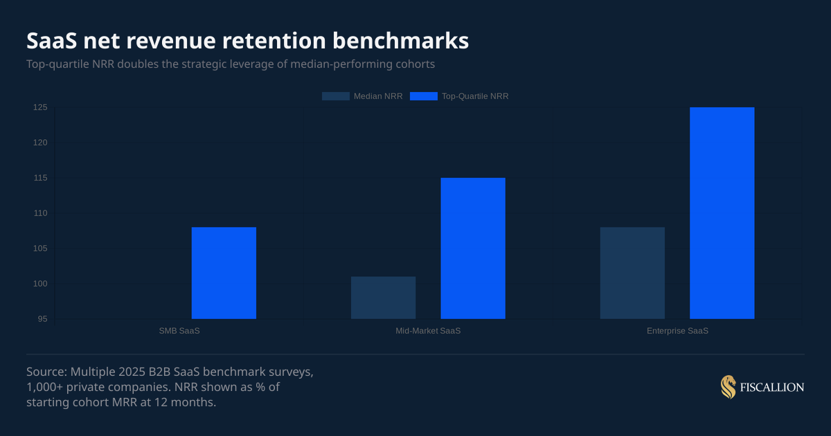
The overall 2025 median NRR sits at 101% - barely above flat. Most SaaS companies are just covering gross churn with expansion revenue and not materially growing their existing base.
ChartMogul's SaaS retention report, which analyzed over 2,500 SaaS businesses, found that the median company with ≥100% NRR grew at 48% year-over-year - more than double the pace of companies with sub-100% NRR. That gap compounds quickly at the $10M–$50M ARR stage, where expansion revenue accounts for up to 40% of total growth.
If your NRR is below 100%, you have a critical constraint: new ARR growth is partially subsidizing existing customer losses. At $10M ARR with 95% NRR, you're losing $500K per year from the existing base before you sign a single new customer. That changes your CAC budget math, your runway model, and your hiring plan.
If your NRR is above 115% at the mid-market level, that's a strong expansion engine. The question shifts to: what product features or customer segments drive it? Because that's what you should be prioritizing in the next product cycle and go-to-market motion.
CAC payback benchmarks: what you should be targeting
Payback period expectations vary by ACV and business model. These are working ranges based on 2025 B2B SaaS data.
The common 12-month payback benchmark is useful as a starting point but misleading as a universal standard. As OpenView's Kyle Poyar notes in Avoid These Common CAC Payback Period Mistakes, the right payback target is inseparable from your NDR profile: below 100% NDR, target under 12 months; 100–120% NDR, 12–18 months is defensible; above 150% NDR, a longer payback can be justified given the compounding expansion value. A $75K ACV enterprise deal with a 9-month sales cycle cannot realistically hit a 12-month payback without either pricing incorrectly or cutting sales costs to unsustainable levels.
What matters more than the benchmark: whether your payback period is improving or worsening across cohort vintages. If payback is extending quarter over quarter, the cause is usually one of three things - CAC rising, early-period churn increasing, or gross margin compression. The cohort tables let you isolate which one.
What to do with your cohort analysis: actions ordered by impact
Building the tables is the first step. The point is what you change afterward.
1. Fix activation before scaling spend (owner: product and onboarding)
If your M0-to-M2 retention is below 75%, address that before increasing your CAC. Adding more customers to a leaky early funnel extends payback and destroys cohort NRR. Identify the top three actions customers need to take in the first 14 days to stay. Make those three actions easier.
2. Segment cohorts by acquisition channel (owner: marketing)
Run your retention table separately for each major acquisition channel - paid search, outbound, referral, inbound content, PLG. Channels that produce customers with 30% lower M12 retention should receive proportionally lower budget in the next planning cycle.
3. Identify the expansion engine and model it explicitly (owner: finance + product)
When a cohort's NRR exceeds 110%, find the expansion source: seat growth, feature adoption, usage-based charges, or price increases. If it's seat growth, model that as a predictable revenue stream in your forecast. If it's ad-hoc upsells by a specific CSM, that's not a model - that's a dependency on one person.
4. Use payback periods to set channel CAC ceilings (owner: finance)
The formula: if your gross margin is 80% and you want a 15-month payback, your CAC ceiling per $1,000 of new MRR is $12,000 (= $1,000 x 80% x 15). Any channel spending above that ceiling is buying growth at a loss. Use cohort payback data to set those ceilings quarterly, not annually.
5. Bring cohort NRR into your board and investor deck (owner: CEO or CFO function)
A board deck that shows aggregate MRR growth without cohort-level NRR is reporting history. A board deck that shows cohort NRR by vintage, acquisition channel, and segment is framing a decision: where should we invest the next dollar of expansion budget? That shift makes the board conversation materially more useful.
6. Run a monthly cohort review, not a quarterly one (owner: whoever owns FP&A)
A monthly review takes 30 minutes once the tables are built. It anchors your monthly finance cadence in customer behavior rather than in trailing revenue totals. Trends in NRR and payback are almost always visible 60 to 90 days before they appear in aggregate metrics.
7. Reforecast runway using cohort decay curves, not a flat churn rate (owner: finance)
Replace your assumed flat monthly churn rate with an actual cohort decay curve. Most SaaS companies lose significantly more customers in months 1 to 3 than in months 9 to 12. A flat churn assumption overstates near-term revenue and understates long-term retention. The correction changes your 18-month runway model in ways that matter.
One case illustrates this clearly: A company had been using a flat 1.8% monthly churn assumption for 18 months — their trailing average, and it felt stable. When we replaced it with an actual cohort decay curve, early cohorts were churning at closer to 3.1% monthly while mature cohorts were at 0.9%. The blended figure was masking a bifurcated retention profile that changed the runway picture significantly.
Five mistakes that make cohort analysis useless
The output of a poorly structured cohort table is worse than no cohort table at all - because it creates false confidence. These are the mistakes Fiscallion sees most often when working with SaaS founders ahead of board meetings or fundraising.
Mistake 1: Using signup date instead of first-payment date as the cohort anchor
What happens: Customers with a 30-day free trial appear to "retain" for month 0 and month 1 even if they never converted. This overstates early retention and masks the actual conversion-to-paying problem.
The replacement move: Use first-payment date as your cohort anchor for all subscription analysis. Use signup date only if you're specifically analyzing trial conversion or onboarding activation.
Mistake 2: Running a blended cohort table with no segmentation
What happens: Your SMB customers churn at 15% annually and your mid-market customers churn at 5%. The blended table shows 9%. You make pricing and product decisions based on a number that represents no actual customer.
The replacement move: Run your cohort table at minimum by plan tier. If you have meaningful segment diversity, run separate tables for SMB and mid-market. The diagnostic signal is in the difference, not the average.
Mistake 3: Changing the definition of "active" mid-analysis
What happens: Someone updates the logic for what counts as an active customer - maybe changing from "paid in the last 30 days" to "logged in the last 30 days." Older cohorts are re-calculated differently than newer ones. The table becomes incomparable across vintages.
The replacement move: Write down your definition of active in one sentence and lock it. "Active means a subscription is in 'active' status in [your billing system] and an invoice was paid in the calendar month." Anyone who touches the model should be able to read that definition without calling you.
Mistake 4: Treating NRR as a company-level metric only
What happens: You report 105% blended NRR to investors and feel comfortable. But three cohorts from 8 months ago are running at 84% because of a pricing change that created upgrade friction. Those cohorts are quietly eroding the base you're trying to grow on top of.
The replacement move: Calculate cohort-level NRR for each monthly vintage. You're looking for divergence between cohort NRR and blended NRR - that gap is where the problem is hiding. This is especially worth tracking because, as ChartMogul's data shows, even top-quartile SaaS companies saw NRR drop from 119% to 107% between 2021 and 2024 - and companies that caught the divergence early had time to course-correct before it showed up in aggregate figures.
Mistake 5: Presenting cohort data without an assumption owner
What happens: You put a cohort retention heatmap in the board deck. Someone asks why retention improved in Q3. No one in the room owns the answer because no one was responsible for the inputs.
The replacement move: Every cohort table should have a named owner who can explain the three most significant variance points since the last review. If no one owns the inputs, the table is decorative.
A cohort analysis template outline you can build today
You don't need a BI stack to get this working. A Google Sheet with four tabs and clean billing exports is enough to start.
Tab 1 - Raw data
- One row per customer per month
- Columns: Customer ID, Cohort month (first payment), Month (calendar), MRR, Status (active/inactive)
- Source: Stripe or billing system export, deduplicated on Customer ID + Month
Tab 2 - Customer retention table
- Rows: cohort months (Jan 2024, Feb 2024...)
- Columns: M0, M1, M2... M12+
- Cells: active customers as % of M0 count
- Use COUNTIFS to pull from Tab 1
Tab 3 - Revenue retention table (cohort NRR)
- Same row structure as Tab 2
- Cells: sum of MRR for cohort in that period / M0 MRR
- Highlight any cohort month below 100% in red
Tab 4 - CAC payback table
- Rows: cohort months
- Columns: blended CAC, M0 MRR, M0 gross profit, M1-M12 cumulative gross profit
- Payback month: first column where cumulative gross profit exceeds blended CAC
What to review monthly:
- Any new cohort entering M3 below 75% retention?
- Any vintage showing NRR below 95% at M6?
- Is payback period for the most recent three cohorts improving, flat, or worsening?
- Which acquisition channel produced the worst M3 retention this month?
- What changed in the product or go-to-market before the worst-performing cohort started?
Once you have answers to those five questions monthly, you have a working FP&A feedback loop - not just a dashboard.
Your churn rate tells you something went wrong. Cohort tables tell you where
A cohort retention table tells you when, in which segment, and at what stage of the customer lifecycle. Revenue cohorts tell you whether the customers who stay are growing or contracting. CAC payback cohorts tell you whether your acquisition economics hold up at current spend levels.
Together, those three tables give you enough to make specific, defensible decisions on product investment, go-to-market budget, and runway modeling - without a full finance team.
The Fiscallion POV is simple: most companies at the $5M to $50M ARR stage already have the data. What they lack is a consistent structure for turning that data into a monthly decision cadence. Cohort analysis is that structure.
If you want a working version of this template built and reviewed against your actual numbers, get the template and audit your current cohort definitions before your next board meeting.
